

A heavy burden lay on the shoulders of Spectrum Networks salespeople in the days before Presentation Management.
Spectrum is the local programming division of Charter Communications, representing more than ninety-one dedicated, hyperlocal news and sports networks. Salespeople had to regularly conduct presentations for local advertisers in markets across the country7. To make this particularly difficult, every single market had its own ratings, and those ratings changed every night depending on what people watched on each area’s local stations.
For example, a Spectrum salesperson might go to a car dealer in Rochester and say, “Look at how good the ratings were for our local channels last night. If you’d bought time on our channels, you would have gotten a great deal.” And that was essentially how they marketed for their entire family of channels across the country, using hyperlocal data that changed nightly.
But the biggest burden lay upon the shoulders of the research team members who made new presentation slides every single day to support the overnights for all ninety-one Spectrum markets8. You can imagine the amount of time and effort this required: new slides every day for every channel in every local market, just so salespeople could approach local businesses.
As complex, difficult, and time-consuming as it was, this is what Spectrum Networks did for years. A constant stream of slides was sent to salespeople out in the field every day to use in their sales presentations. However, there was no real way to conduct analysis on those slides, so the company never really knew which slides were being used by whom, when they were using them, or how effective individual slides were.
That made it practically impossible to tweak and improve slides, so it was a monumental task being performed every day with no system in place for analyzing slide performance.
Can you imagine if any other form of marketing communication were being done without analysis? Would any company spend millions on a radio or television ad if they had no way to analyze its performance? Yet that was the reality for presentations at Spectrum, just as it continues to be the reality for many companies.
Then Spectrum implemented Presentation Management and created a Structured Storytelling library, and it changed everything. Suddenly, they were able to put out new ratings information quicker and more efficiently by simply updating parent slides with the latest ratings.
At first, they simply applied this to their old method of producing daily slides, but after a few months, they realized they had access to real data about their slides. They could see which slides were being used and by whom, and it gave them insight into which shows on their networks made the greatest emotional impact on clients. Now they could tweak their presentations to make them more effective, honing their messaging and cutting out the dead weight.
Salespeople found that their presentations were more streamlined and effective, which made their jobs a lot easier. The research team that had been preparing those daily slides for ten years had so much menial work taken off their plates that many of them were moved to support other strategic initiatives. In the end, fewer people were needed to update parent slides for the sales team.
Besides making life easier for everyone involved, this represented a tremendous cost savings. Suppose each member of that research team made a salary of $100,000 a year.With five people on the team, the company was spending $500,000 annually on salaries alone to create brand-new slides every day for salespeople in local markets. That adds up to $5,000,000 over ten years. That’s a huge amount of money being spent on a tedious task that had no analytics to track the performance of the slides being created—a tedious task that is largely unnecessary with a structured slide library.
In fact, once Spectrum had access to slide data, an analysis of the data revealed that the research team was wasting an inordinate amount of time building content that nobody used. Often, salespeople were making sales without even touching some of the slides that the research department put out, which means a whole lot of work was being done for no practical reason.
Once the company realized this, they were able to stop wasting time on things they didn’t need and refocus their efforts on things that had more effect on actual sales. It’s just one example of how real scientific data about their presentations through Presentation Management, helped them identify misplaced resources and make their slides more efficient.
Making Sense Of The Data
It’s one thing to feed someone a bunch of data; it’s another thing to make sense of it. The genealogy of slides, as discussed in the previous chapters, helps make sense of the data and gives context to it. Instead of mere quantitative data, you have access to contextualized and qualitative information about each and every slide.
You know the position of the slide within a presentation, how many times it has been viewed, how many times it has been shared with a client, and how much time has been spent on it. You know how many times it has been downloaded, and what your best and worst performers are doing with it.
A structured slide library makes Presentation Management possible by providing a dashboard with easy, succinct information about every slide. First, at the top, you can see the trends for any and all activities of all users, files, slides, and shares to give a quick snapshot of what’s going on, where slides are going, how many you have, and so on.
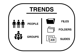
Beneath that, you have two columns that provide more research data. The one on the left shows users, groups, and folder permissions, and the one on the right shows data for files and slides, including the top five files among users.Overlaid on the data, you can see the top slide creators and how many slides were downloaded. Each chart is available as a table, bar chart, line chart, or donut chart, and each one can be downloaded as an image or Excel chart. You can also connect to your API so any of your development teams can send any piece of business intelligence to their senior executives’ dashboards.
For example, you could send a chart of the top five files to your CEO’s dashboard. That way, the CEO could glance at the corner of their screen and instantly understand which files are in the top five, how they’re being used, and how many times they’ve been presented. All your CEO has to do is click on a file, and they can see exactly how many times it was used and who used it. In other words, every chart becomes a portal to the rest of the data, and every chart can be portaled out to the reporting dashboards of senior executives.
This helps you to identify best practices that you can then instill in other presenters. For example, if your top salesperson always uses a slide that presents a message from the CEO, then maybe you should recommend that other presenters start using that slide. If your worst presenters always just show pricing, then maybe you need to help them 125 build out a story around the prices—or maybe you need to lower your prices.
Consider the popular social media channels of our day. Twitter is a technology that gives you potential access to a large audience, but actually reaching that audience depends on how you use the platform. If you want to make a real impact with Twitter, you have to deliver the right message to the right audience in the right way at the right time. The same goes for Facebook. The platform offers the potential to create an online community around your company, products, and services, but you have to use it well. Companies that leverage the technology of platforms like Twitter and Facebook wisely reap the rewards in terms of audience engagement.
The same is true of Presentation Management. Presentation Management software is a form of technology that enables companies to communicate with their target audience more effectively, and the medium it uses are presentations. AT&T uses phones, Twitter uses social media posts, and Shufflrr uses slides.
A good piece of Presentation Management software gives you access to a vast array of data about your slides, but making the most of this requires two things: good reporting and thorough analysis. Reporting refers to the gathering of the data itself—the who, what, when, where, how, and why—and analysis is what you do with that data once you have it.
So, what’s the best way to analyze presentation data? Specifically, what’s the most important data you can glean from your slides? We recommend the following:
- How many times has it been downloaded?
- How many times has it been used and reused?
- Who has used and reused it?
- How many times has it been viewed by a client?
- How much time was spent on the slide when shared with clients?
If you’re not getting at least this information from your Presentation Management services, then they are not doing you justice. If you can get even more data than this, all the better. Remember, the bigger value equation is how you use that data, but of course, if you don’t have access to the data in the first place, then you can’t use it.
These five questions give you the basic data you need to identify which slides are most effective, which ones aren’t working, and which ones your best and worst presenters rely upon. This, in turn, enables you to hone in on your strengths and prune your weaknesses, which transforms your presentations into a living narrative about your company that keeps getting better over time.
THE MOST IMPORTANT DATA FOR SLIDES
- How many times has it been downloaded?
- How many times has it been used and reused?
- Who used and reused it?
- How many times has it been viewed by client?
- How much time was spent on the slide when shared with clients?
Remember what it was like when you first learned to ride a bicycle? At first, it was tough, and you kept wobbling, losing your balance, and falling. Maybe you skinned your knees a couple of times. Over time, however, as you practiced and built up momentum, you found that you could maintain your balance and control of the bicycle with greater ease.It didn’t take long until you could ride a bike with such ease that you hardly had to think about it.
The same goes with Presentation Management. As the data comes in, the pieces are going to begin falling into place.You’ll start figuring out what works and what doesn’t, and you’ll be able to lean more into your strengths. Once you’re flying fast and confidently, your communications will be constantly up to date, relevant, and telling the same compelling story about your company. You will be able to anticipate the slides you need to reinforce product launches.
Never again will you have to start from scratch when you want to give a presentation because your presentation communication channel will provide a steady stream of data that allows you to anticipate changes, adjust on the fly, and share the best and most impactful stories with every presentation. Everyone will always be using the right logos, the right colors, the right messages, and the right language. Information will always be correct and current, and there will be no more gaps in your knowledge about who is doing what.
Do you see how dramatically this is going to change the way you present? In some ways, we’re only just now realizing the impact of Presentation Management on the way we present, sell, and communicate. Let’s take a glimpse into the near future to see what Structured Storytelling might look like very soon.
7 “About Spectrum Networks | Charter.” Corporate.charter. https://corporate.charter.com/spectrum-networks .
8 “Spectrum Reach operates in 36 states and 91 markets. From reaching millions of households to targeting consumers within 5 miles of your business.” Spectrum Reach. https://www.spectrumreach.com/markets-map